Tag: art (page 16 of 18)

PES Films

I recently came across this highly amusing animation sight all created by PES. I have been given a few animation lessons from Mr. Michie. My first attempt was making a plastic ballerina cake topper dance. I did it the old fashioned way, by taking a series of pictures one by one as we slowly turned her in a dance and then loaded it into Adobe Premier to create my film.

I have also been lucky enough to get to work with the wonderfully kind and talented, Kim Noce on an animation project and learn a few lessons from her. I used a web-cam as my “camera”, on my small part of the project, which made the film making process a whole lot easier.  As that “film” can be loaded up as one piece, instead of the individual photos. I can’t even begin to imagine the amount of time it took to create these videos. They are wonderfully sweet and brought a smile to my face, I hope they bring one to yours as well!

I think the addition of the Peeps makes it feel like Eastery fireworks!

Penguin Threads

The Art blogging world has been all a buzz the past few weeks with the news that Jillian Tamaki has been commissioned by Penguin books to create stitched covers for their Classics series that will be released this Fall.

This was such exciting news. I too, love to embroider things and there is not always a rhyme or reason to my pattern and I appreciate that in Jillian’s work, the beautiful flow. Not only that, but her extraordinary use of such vivid colours for this series just makes them pop out at you. I think I shall now, forever see Emma, dressed like this, with pastel rainbow hair whipping around her face, as she waits for Mr. Darcy.

I can’t wait to see what they look like in person! To learn more about this project click here.

YIPPEE!

YIPEEEE! School is out for Easter Break and I am very excited!

(Image by Kelly Reemtsen, I’m Not Falling For You, “Yippee” added by Jennifer Michie)

*Kelly Reemtsen is an artist I have only recently discovered and I really enjoy her work. This series in particular where surreal headless 1950’s/60’s clad women, holding everyday household and gardening objects fill the canvas before you. I love the differing shades of yellow used in the above image, it is so simple, yet so complex.

Hear Me Roarrrr….

I am roaring into the week. We put our clocks forward this weekend and suddenly everything and everyone seems to be “springing” into action.

There are exams and meetings and yoga classes to attend this week, cleaning and laundry that has to be done and somewhere in there, time to just sit and be with Mr. Michie; because that is more important than anything else on my “To-Do” list. So, I am just going to keep on roaring and go with it!

(Image by Christine Hale, “Roarrr” added by Jennifer Michie)

Art-O-Mat

When I was in College, they installed one of these in our Art Department. It was there on a trial basis to see if something like this would work! Well, we all loved it! What is it? It is a refurbished cigarette machine that sells art instead of cigarettes. I adored the fact that in keeping with the style the design was still very much the “old cigarette case” look, that very 1960’s-esque edge to it.

I don’t know if they have changed this part or not, but we had to use a special “token” to get the art out. You handed in your money to the Art office and received a chip that you would use to collect your chosen piece.

You really had no idea what was going to be in the boxes. The images used to “describe” it, was either just the Artist’s name or a very brief line, like, “man in a box”. You didn’t know what was going to pop out and that was half the fun. There was all sorts of things from mini oil paintings, to a book of photographs that told a story, to miniature statues, sometimes it was just typed text that had been pasted down and decorated.

I love the idea of “Art for the Masses”, and I mean this in the best possible sense. Not mass produced cheap art, but the Andy Warhol idea of mass production, in the sense that you were creating 20 or 30 of the same thing and quite possibly something to never be created again, but for $5, everyone had a chance to own a little piece of Art. It made it accessible and Art should be accessible. (I know I stray here a bit, in that Andy Warhol was mass producing to make a point about Art, but I think you get my point as well.)

I have the very lovely Sherry to thank for tweeting out this pic to me, it made me smile!

If you don’t already follow this gal through twitter, you certainly should, she is a sweetheart! Thanks for sending me this image, Sherry!

(Image Copyright: MerrieSherrie “Art dispensing vintage cigarette machine, Cosmopolitan, Las Vegas”)

To learn more about Art-o-mat, click here

A Trip to the Tate

I had the great fortune of leaving the cupboard for a little while on Wednesday and I got to accompany an Art trip to the Tate. It was a treat walking around with the students, getting to sketch some things in my sketchbook and taking as many photographs as I could.

I haven’t been to the Tate in quite awhile. Mr. Michie went on a school trip before Christmas and he inspired me to want to go again after such a long absence. However, they were hanging so many things that a lot of the rooms were closed, so I didn’t get a chance to see as much as I had hoped.

One piece I did see was by the conceptual artist Cerith Wyn Evans. Who had a stunning, ballroom size Venetian chandelier hanging in a room; that lit up very slowly and once warmed up the lights would flash on and off. It was so beautiful and yet surreal to see in white this room, the bold colours of the chandelier’s droplets and flowers were all that stood out, against the blinding light when the bulbs reached their highest power.

My minor in College,was Arts Management and one of the courses I took was a gallery class. One area we focused on, was how do people use the space they are in and interact with the space they are in.  I always think back to that class as I watch people in a gallery/museum.

There was no way around this chandelier it was so wide and hung so low it almost touched the floor. You couldn’t miss it. Yet, I stood against a wall and watched people breeze past it, give it a wide berth, as if there was nothing of importance to see, or, they would quickly glance at it and move along. Maybe its sheer size unnerved people, they felt it was too big to interact with, it isn’t as “simple” as standing in front of a painting on a wall. Who knows? It was just something that fascinated me.

I had a lovely day out and I think the students did as well, a lot of good ideas for their exam theme of “Similarities & Differences”. I just thought I would share a few of my favourite images from the day with you:

Theodore Von Holst, The Fairy Lovers, about 1840
Michael Ayrton, The Temptation of St. Anthony, 1942-3
Henry Fuseli, Titania and Bottom, about 1790
William Blake, The Book of Thel pl. 7, probably 1796
John Linnell, The Last Load, 1853
Cerith Wyn Evans, Chandelier

I picked up these two postcards as my treat. I thought they offered an interesting perspective on “Similarities & Differences”, so I am just going to pocket them away as an idea for a student in need:

{Self Portrait with Fried Eggs, Sarah Lucas, 1996 (left) Honeymoon Nude, John Currin, 1998 (right)}

Matchboxes

I have been meaning to post about this little piece I saw on Youtube for ages! It is composed of 178 matchboxes, designed by Prague based designer Pavel Fuksa.  I think it is pretty neat! You can watch the video below:

A Book

One of my colleagues in the Art Department is a wonderfully delightful woman. She usually marches into my cupboard in the morning, singing “Hello” to me, like my own personal Ethel Merman.

She was commissioned by a county museum to create a piece about books. She used a vintage book and then began to take it apart. Drilling through it, slicing out interesting text and images, putting it back together in an accordion fold, that when opened creates the most fascinating scenes as you peer through the “tunnel” into the book. One of my favourite bits of text is the one used in the image above, “A constant source of surprise, was the joy of doing it”.

A resourceful artist and one who does not waste, she stacked the circles that were drilled out of the book on top of each other and screwed in a acrylic holder to make a resting spot for the book when it is closed.

It is a truly charming piece of work and is something that I will be photographing and documenting over on In the Art Cupboard this week, so please come over and take a look!

Gauguin

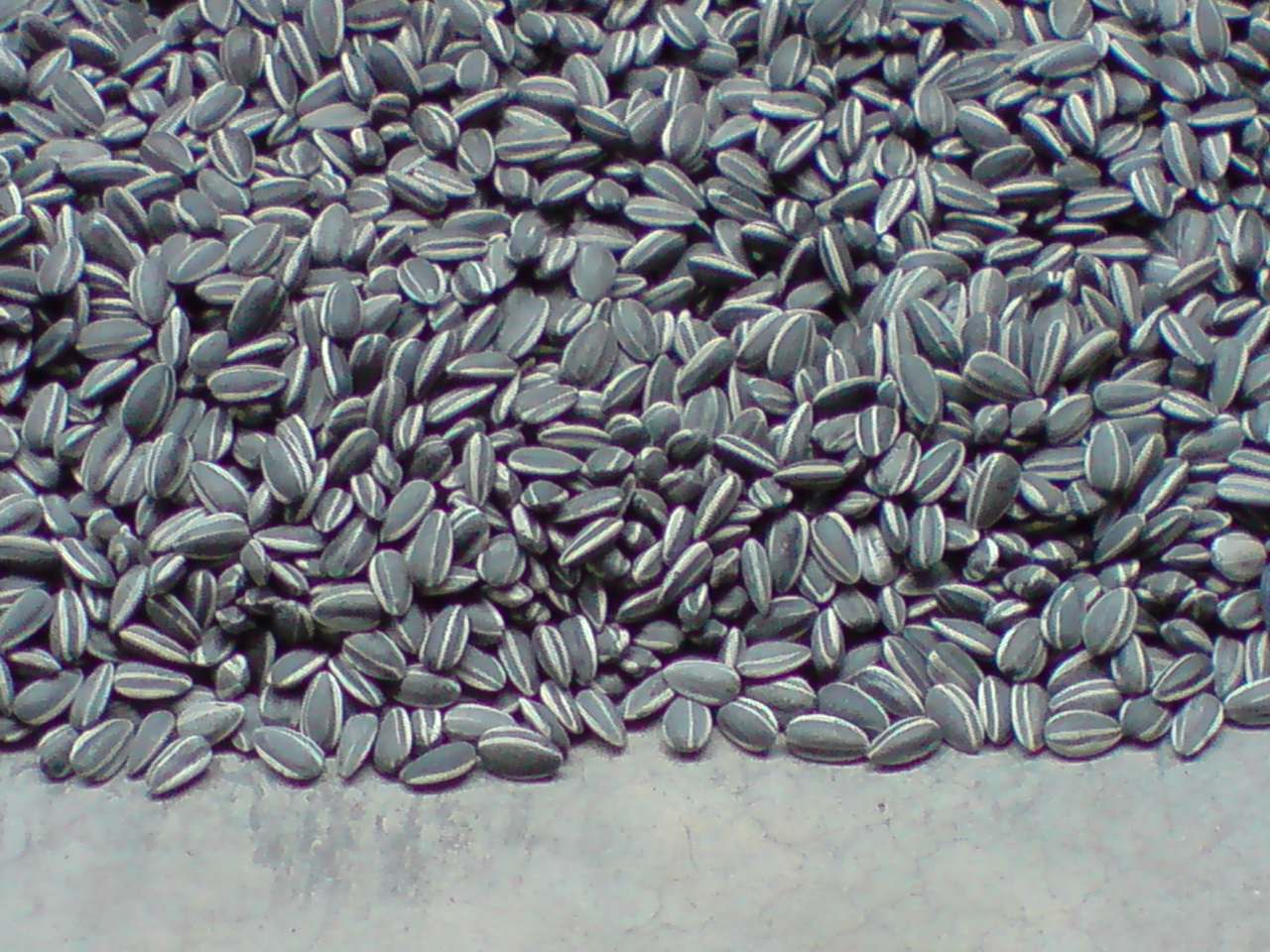
I went to see the Gauguin exhibit today at the Tate Modern, it was a wonderful day! When we first entered the Tate we headed off to see Ai Weiwei’s Sunflower commission. It is composed of millions of porcelain sunflower seeds that are all spread out on the floor, it was unbelievable how real they all looked. I was saddened though, that you can no longer walk on them.

The Gauguin exhibit was interesting, I saw pieces of his work that I was never aware that he created. For instance, a series of wood carved statues that were so intricately designed, their Tahitian influence so apparent in their almost totem pole shape, they were beautiful.

There was a lot of people there, a little too much for my liking, all pushing and shoving, which is something that I have never understood. I felt they were there to simply say they had been, not to actually take it in and enjoy it.

After stopping for a spot of cake and tea, we headed over to St. Martin’s crypt to see next year’s contenders for the plinth in Trafalgar Square.  You can vote on your favourite, these were my two:

It was a wonderful day out, in the pleasure of good company and an absolute luxury to be in 1/2 term, spending a usual working day, walking around and soaking up the Tate.

Into the Woods

A little while ago, I came across an article from last year, on “designvagabond” and thought I would share it. I appreciate contemporary architecture and design, but it is not always for me. I do not like the cold,sterile feeling that some designs leave you with. But, I do love the use of lighting, windows and the idea of bringing nature into your indoor environment.

Having no window in my little cupboard, this is an office I would gladly call my own. The architect’s plans are beautifully executed. This is a little office nestled in the woods and I love the fact that as you work, you can watch the birds, see a leaf fall, see a branch burst into bloom, watch night slowly close in on you… You get to see life unfold before your eyes, you get to see one season slip into the next.

You become part of something more. More than just someone cooped up in an office, you can live vicariously through your windows and as a girl who doesn’t have one at the moment, I really like that!